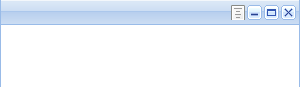
Tools probably are one of the lesser known but highly useful components of the ExtJs/Ext.Net/Coolite frameworks. Tools allow you to add minimize/maximize etc. type of buttons found on regular GUI Windows, and respond to their Click event (see the adjoining image for an example of tools).
Tools can be specified on a Panel or any ExtJs class derived from Panel, and they are  rendered on the right inside the Top Bar for the Panel.
ExtJs/Ext.Net ship with some default icons for tools, that represent the common tasks (e.g. Help, Pin, Unpin, Minimize, Maximize etc.) for tools. Here’s an example of tools inside a Window, and how they can be used:
{syntaxhighlighter brush: xml;fontsize: 100; first-line: 1; }<ext:Window runat=”server” ID=”wnd” Width=”300″ Height=”300″>
<Tools>
<ext:Tool Type=”Minimize” Handler=”#{wnd}.minimize();”></ext:Tool>
<ext:Tool Type=”Maximize” Handler=”#{wnd}.maximize();”></ext:Tool>
</Tools>
<Content>
Your Window content here.
</Content>
</ext:Window>{/syntaxhighlighter}
An important point to notice is that a Tool just provides you a button in the Panel’s TopBar, but does not provide any functionality what-so-ever. Even for the Tools shipped with the toolkit itself, they provide just some common predefined icons. Do NOT expect them to provide the corresponding functionality. It is your responsibility to implement the Tool functionality by providing the usual Handler or the Fn attribute on the Tool.
So, far so good. But what if the predefined tool types do not fit for you and you want to have a custom icon for the Tool (Ext.Net uses the attribute name Type for the pre-defined tools, whereas ExtJs uses the attribute name id. In my opinion, both these attribute names are misleading, and we could have been better naming the attribute as just icon – because that’s what the tool provides, an icon with no functionality with it).
It’s simple (defining a custom icon for the Tool), and involves a couple of steps:
1) Create a CSS class for the tool. The class-name would be important, it should begin with x-tool followed by a name for the tool (you are free to choose any name) separated by a hyphen. Here’s how you would do it:
{syntaxhighlighter brush: css;fontsize: 100; first-line: 1; }.x-tool-myicon
{
background-image: url(icon.png);
}
.x-tool-myicon-over
{
background-image: url(icon-hover.png);
}
{/syntaxhighlighter}
The second class here defines the icon when mouse hovers over the tool. You can skip this if you want to (However, it is useful to specify this and provide an icon variation that let’s the user know that the Tool is clickable).
2) Instead of the Type property, specify the CustomType property on the tool. Here’s how:
<ext:Tool CustomType="myicon" Handler="Ext.Msg.alert('Tool Clicked', 'Custom tool was clicked');"></ext:Tool>
Here the value of CustomType should be the name of the tool (excluding the x-tool prefix) you chose in CSS. You should specify either the Fn or the Handler property and provide the js function or inline code that should be executed when the tool is clicked.
The documentation for the tools property for ExtJs is available here:
http://www.extjs.com/deploy/dev/docs/source/Panel.html#cfg-Ext.Panel-tools
As you can see, you can also provide tooltips etc. for the Tools. Additionally, by using the background-position attribute inside the CSS class for the Tool, you should be able to use image sprites for tools (In fact, all Ext.Net built in tools constitute a single image sprite).
The attached files below demonstrate the use of built-in as well as custom tools for Panels.
Please take care that although the icon & mouse-over icon attached below are 16×16 pixels in size, the recommended size for Tool icons is 15×15 pixels (I just felt lazy resizing the icons and attached them without resizing).
the above process is for defining custom tool for ext.net.i want it in ext Js only.i want to add my own icon on title bar ofa panel and i have to do some acton on clicking on it.could any one please suggest me any better method?